Traffic

When I first got here, I looked around for a service that would allow you to try to find out what time of day was best on a given commute (based on historic data). Unfortunately, I wasn't able to find any. However, since commute times are readily available via 511.org, I decided to write a perl script using LWP::Simple. 511.org is polled every 5 minutes and the results are written to a flat text file.
I wrote a second script which does some simple mining of the data: It calculates average commute times as well as standard errors, and produces a plot like on the left for south san francisco to albany. The data is only for weekdays and should exclude holidays (the only one so far is thanksgiving).
Similarly, in order to try to figure out when the best time to leave and come back for the weekend, I started gathering data on 80 west and east between albany and fairfield, as well as between albany and Livermore and albany and Walnut Creek (below).


Although I doubt I will find anything interesting, I also create graphs for each route across the hour, regardless of time of day. This would in principle allow you to see if there were any overall rules of thumb for leaving at :00, :15, :30 , :45 etc. So far things look pretty flat though.


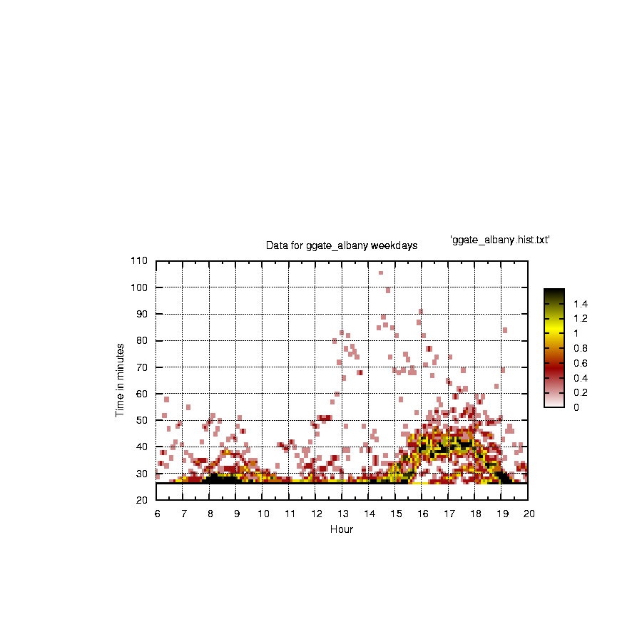
Last weekend, I realized that averaging the data probably is an overly lossy thing to do. Better would be to be able to see a histogram of all the recorded commute times for a given route and time of day. My first idea was to image map the plot of average times vs. time of day to histograms. However, this is ugly and clunky. A better way to express this third dimension of data is with color. The idea is to have a color coded histogram of data for each time of day such that extremely frequently observed commute times get one side of the color spectrum (black for example) and infrequently measured commute times get another (white for example). It took a really long time for me to figure out how to get PM3d to work correctly, but I eventually did it. The major problem was actually just formatting the data. Another important trick is to make sure you have the same number of data points for each "slice" (= time of day), even if the data hasn't been measured... just make a lot of bins with zeros. The results are actually kind of beautiful and are beginning to show clear patterns where the average plots showed none. Some examples are shown to the left. It is important to note that because I am not smart enought to figure out exactly how PM3d works, the color scale is relative rather than absolute (i.e. even if the scale goes from 0 to 1.8, the number of observations in the black bin might be closer to 20).
If you have an interest in the project, drop me an email.
Some more data


No comments:
Post a Comment